Bodega Brands
CPG
Bodega Brands
Brand Identity / Web Design / Investor Deck
March 2026
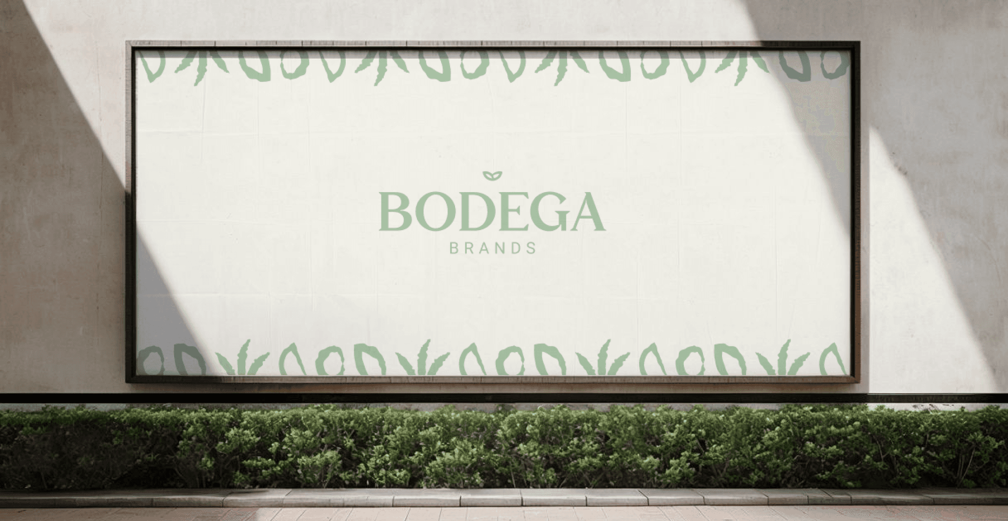
Bodega Brands is a house of brands operating in the fresh beverage space. As the parent company behind a growing portfolio, it needed an identity that could stand confidently on its own, separate from the brands beneath it. The brief covered everything from a brand refresh to a full website design and investor deck.
The challenge was giving the parent company its own voice: authoritative enough to command respect in the industry, but modern and approachable enough to feel relevant today.


Problem / Solution
The existing brand wasn't doing enough heavy lifting. It lacked the clarity and presence needed to work as a standalone entity, and it wasn't landing with the credibility required for serious investor conversations. The parent company was getting lost behind its own portfolio.
The refresh started by establishing a clear visual identity that felt distinct from the sub-brands while still sitting naturally above them. The logo, colour palette, and brand language were all built around the idea of quiet authority: grounded, considered, and confident without being loud. That same system was then carried through the website and investor deck, ensuring the brand held up across every context it needed to perform in.

Outcome
The result is a brand that finally feels like a parent company. It has the presence to stand alone in the industry and the polish to hold its own in front of investors. The guidelines created a solid foundation for the brand to grow consistently as the portfolio expands.